Variance and Standard Deviation are the most commonly used measures of variability and spread. Variability and spread are nothing but the process to know how much data is being varying from the mean point. And Variance tells us the average distance of all data points from the mean point. Standard deviation is just the square root of the variance. As variance is calculated in squared unit (explained below in the post) and hence to come up a value having unit equal to the data points, we take square root of the variance and it is called as Standard Deviation.
Before understanding variance and Standard Deviation, you need to know some basic terminology and central tendencies of data defined in statistics.
I have tried to explain all of them here: basic statistics for data science part 1. you may like to refer.
Table of Content:
- Variance and Standard Deviation
- Quartiles
- Outliers
- Box Plot
Variance and Standard Deviation
Let me explain with the help of an example, what is Variance and Standard Deviation and why we need those measures when we have something called central tendencies like mean, median and mode.
Problem: Basketball coach having tough time in selecting one player among three available choices. He is confused because all three share the same average scores. Now the problem is on what basis coach selects one over others. Here comes Standard deviation to help coach to take the decision.
| Player 1 | |||||||
| Points Scored per game | 7 | 8 | 9 | 10 | 11 | 12 | 13 |
| Frequency f | 1 | 1 | 2 | 2 | 2 | 1 | 1 |
| Player 2 | |||||
| Points Scored per game | 7 | 9 | 10 | 11 | 13 |
| Frequency f | 1 | 2 | 4 | 2 | 1 |
| Player 3 | |||||||
| Points Scored per game | 3 | 6 | 7 | 10 | 11 | 13 | 30 |
| Frequency f | 2 | 1 | 2 | 2 | 1 | 1 | 1 |
*Frequency mean how many times that score occurs. These are random scores taken just to explain the concept.
In Statistics terms, Variance is defined as the average of squared distance of the data points from mean. It can be computed as follows:


Using the above formulas,
So if you calculate, Mean for all three players = 10. If mean is different then we can easily go ahead with the one player who has highest mean. But that is not the case here, so we will go ahead and calculate the standard deviation.
Standard Deviation: For Player 1 = 1.73, Player 2 = 1.48, and Player 3 = 7.02.
Answer: So Coach will select Player 2 as Player 2 deviates less from mean, which tells us that on an average Player 2 will score near the mean value. Player 3 is least reliable and Player 2 is most reliable.
Quartiles and Outliers
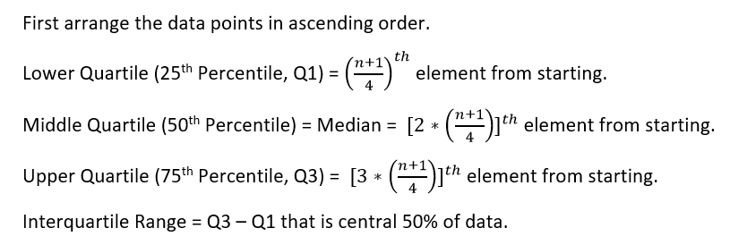
Quartiles are the values which divide the data into four equal parts. Quartiles help in determining the outliers in data. In short, outliers are nothing but the farthest data points from the mean value. Now question comes how far from the mean, we can declare it as outlier. So this far value is decided using the quartiles.
First or lower quartile denotes the first 25% of the data, fourth or upper quartile denotes the top 25% of the data.
And these quartiles can be calculated as follows:
Let’s calculate these values using an example below. Suppose points scored by some player in different matches are given below:
| Player X | |||||||
| Points Scored per game | 3 | 6 | 7 | 10 | 11 | 13 | 30 |
| Frequency f | 2 | 1 | 2 | 3 | 1 | 1 | 1 |
Now arranging the scores in ascending order:
3, 3, 6, 7, 7, 10, 10, 10, 11, 13, 30. [Frequency tells how many times player has scored those scores]
N = 11.
Minimum value = 3.
Lower Quartile (25th Percentile, Q1) = (11+1)/4 = 3rd element = 6.
Middle Quartile (50th Percentile) = Median = 2*(11+1)/4 = 6th element = 10.
Upper Quartile (75th Percentile, Q3) = 3*(11+1)/4 = 9th element = 11.
Maximum value = 30.
Interquartile Range IQR = Q3 – Q1 = 9th element = 3rd element = 11-6 = 5
So we can declare a data point as outlier if it falls outside the range
Q1 – 1.5*IQR to Q3 + 1.5*IQR
So let’s check if player has outperformed in certain games.
Lower range value = Q1-1.5*IQR = 6-1.5*5 = -1.5
Upper range value = Q3 + 1.5*IQR = 11+1.5*5 = 18.5
So if we check then only 30 is outside the range, and hence we say while scoring 30 in that particular match player has positively outperformed. Value 30 is outlier.
In case any value is less than -1.5 then we say that in that game, player has negatively outperformed.
Box plot or Whisker plot
Box plot or Whisker plot is pictorial representation of quartiles. By plotting box plot, we can easily identify the outliers and also understand the spread of data points. Below is the example of the box plot and representation of different quartile values.

This is all about variance, standard deviation, quartile, outliers and box plot to explain the variability and spread of the data. there are some other techniques which I will explaining in upcoming posts. However above described ones are most important to get started with these concepts.
Recommended Article: Basic Statistics for Data Science Part 1
Feel free to contact us for more details and discussions.

Awesome
LikeLike
Very Good contents in simple language
LikeLike
Thank you.
LikeLike